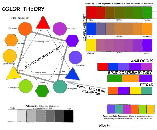
My favorite color theory is analogous. I like it because whenever artists use this color theory, it's very visually interesting how they use one color and many different hues of the same color.
|
My favorite color theory is analogous. I like it because whenever artists use this color theory, it's very visually interesting how they use one color and many different hues of the same color.
0 Comments
the rule of thirds is when a photo is broken down into thirds vertically and horizontally and you use the lines and squares to help you find points of focus.
Double exposure is when two photos that work well together are merged together to make a single image. Boat-n-hand is when a photographer uses different camera angles to make an optical illusion. A silhouette is an image of pretty much anything or any person, and the object has no clear features and is usually black and has a light background. Black and white/sepia is used to make photos look older or timeless or give it a different tone. Emphasis is when there is a certain point in a photo that the artist wants you to see, so usually its the objects they want you to see colored and the rest of the picture colorless. 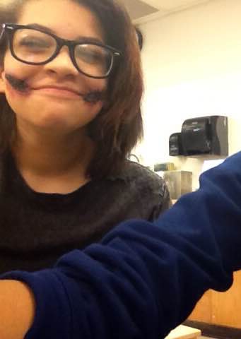 My makeup was cuts on my face, near my mouth. The makeup I used was used to fool the eye, and it looked realistic because of the latex, black paint, fake blood, and different oil based makeup. The latex was used to make the tears and cuts in the skin, black paint used to make the cuts look older, fake blood for you know, blood, and the oil based makeup used to make it look bruised and more realistic.
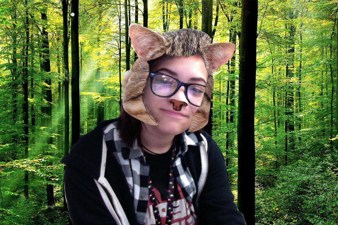
 I am pretty against photoshopping and manipulating people and their bodies and features. I'm against it because I doesn't seem very realistic, comparing what the average person looks like to the people photoshopped in magazines and ads. If it's for a clothing ad or magazine, and they photoshop the person and the clothes they're wearing, then the clothes that look good on the photoshopped and unrealistic person probably don't look the same on other people in real life. But if the photoshop is being used in a way that doesn't totally change the look of the model, then I'm all for it. Like if it's used to fix maybe a very noticeable blemish on someone's face. But if it's used to change someones face and body features completely, like the length of their arms, legs, neck or how big or small their eyes or lips are, then I really don't think they should be using it for that kind of thing. It gives off the idea that no one's supposed to have blemishes, or flaws, or be a certain height, or have a certain skin tone, or not have stretch marks or anything at all on their bodies.
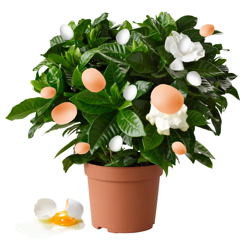
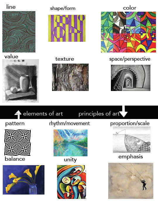 My favorite element of art would have to be value. I like value because it looks really cool to me when artists draw and use it, and it also makes drawings and paintings look more realistic and a bit three dimensional. My favorite principle of art is proportion. I like proportion because in artwork it also makes the picture more realistic or it could also make the painting look a bit funny. Like when the proportion of a fish is three times the size of a person, it actually draws attention towards the picture.
Elements and Principles link.
|
|

 RSS Feed
