|
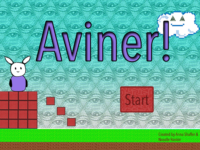
Game unit: Aviner!
Our game was more of a modern and simple game. Making the game from the beginning to the end was very difficult. My favorite part of the game making process was designing the characters and backgrounds. I would have made the villains in the game do a bit more and the boss more difficult as well. Phenakistoscope
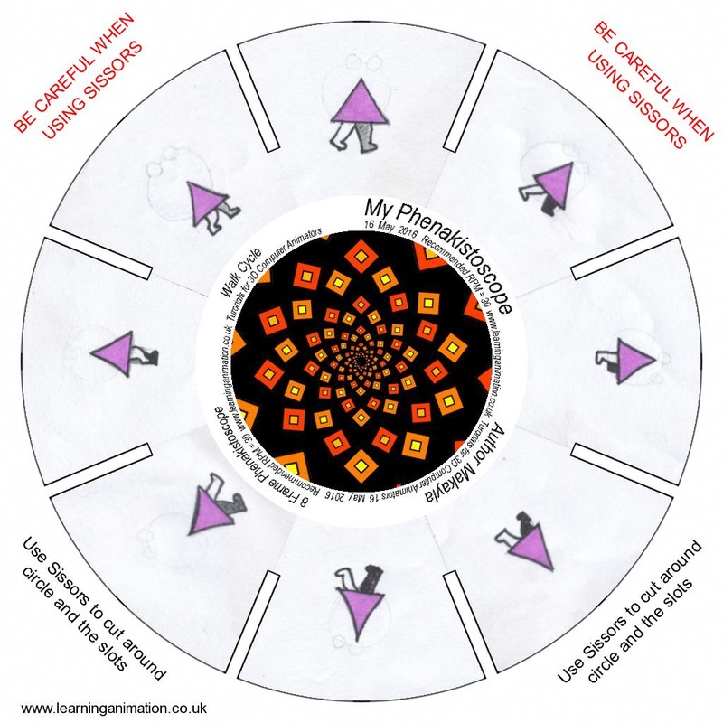
A phenakistoscope is a spinning wheel with slots in it, spun fast to make a line of drawings appear to be moving. A loop is a motion in the drawings that seems to be repeated over and over again, and it worked with the walk cycle because you want the walking to be in a loop and not just stop after it's finished. A flip book seems the most interesting to me because of how much work and effort it took to make the animations and how hard it is and was to make sure it was perfectly lined up with the previous drawing, and how the end product is pretty cool to watch and see how it moves around. Making the phenakistoscope was a bit difficult. Making sure the slide before it wasn't too alike with the other one was hard. Along with keeping the drawing in proportion throughout the entire thing was hard as well. Color Theory Project
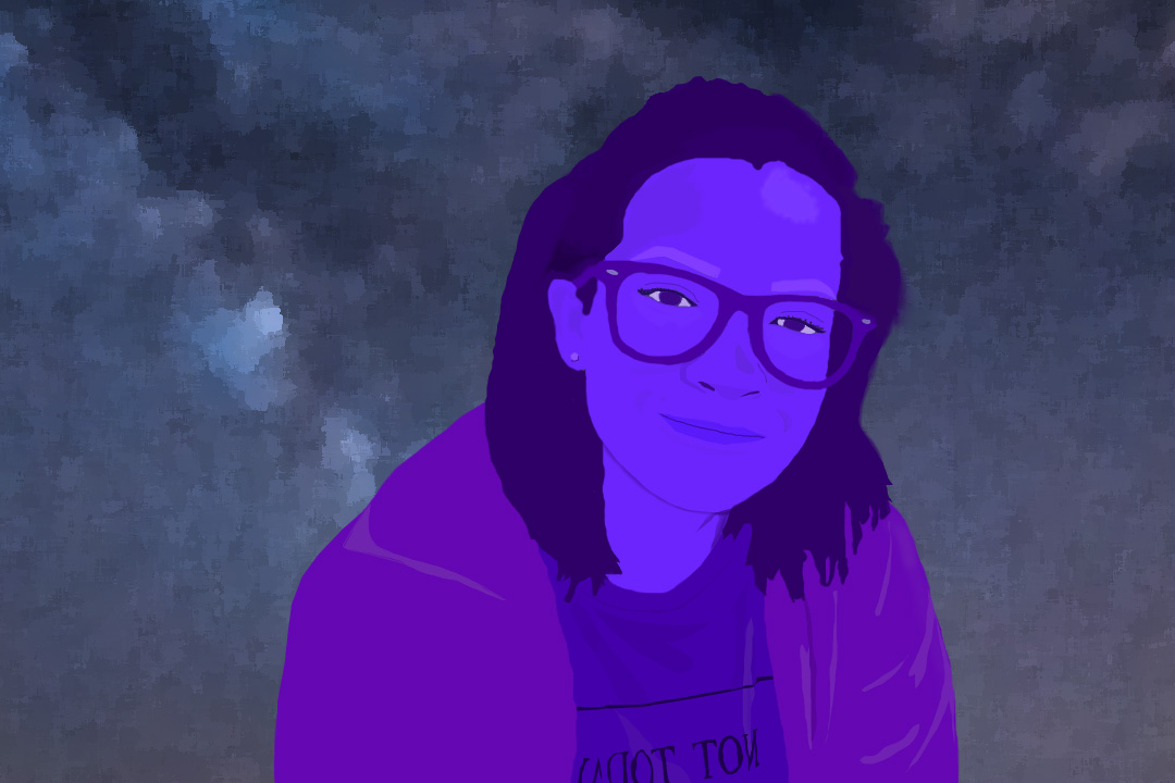
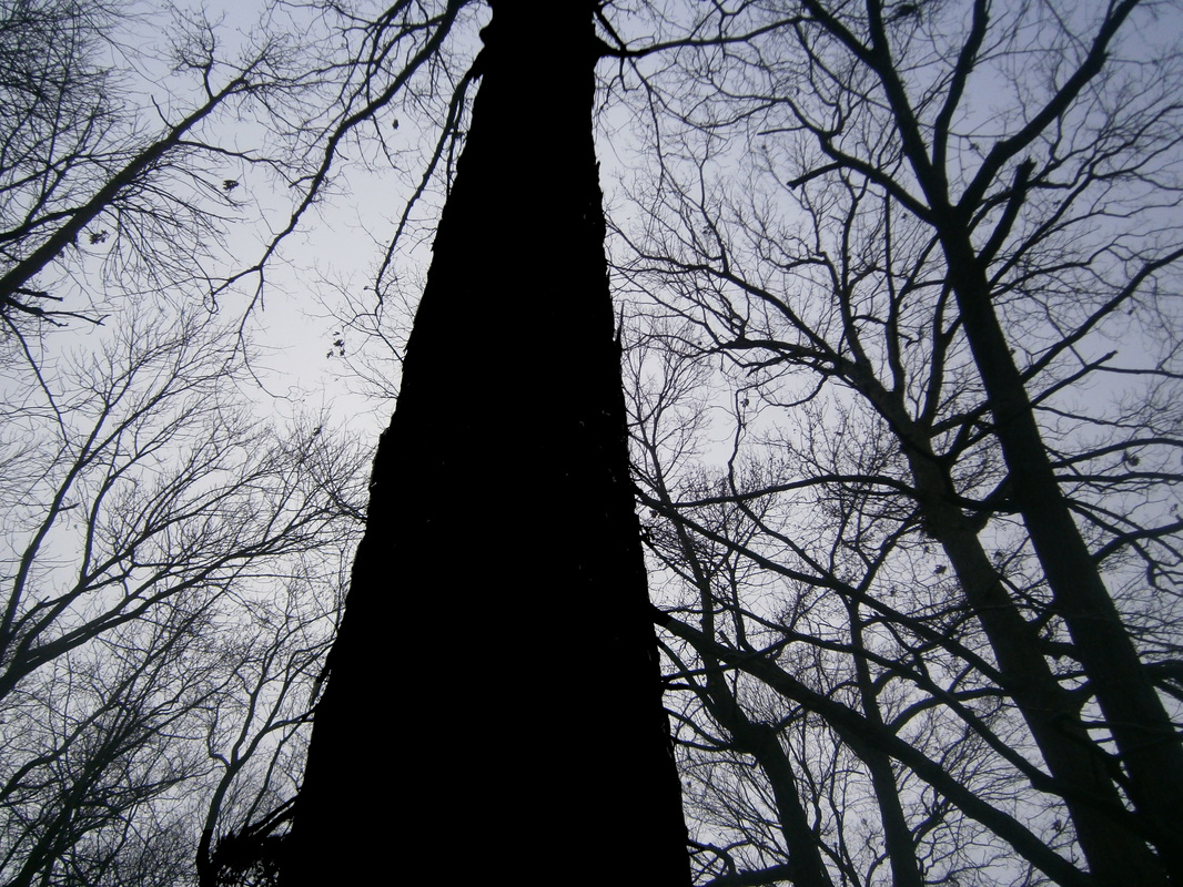
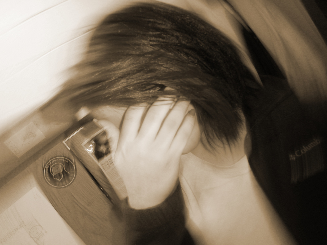
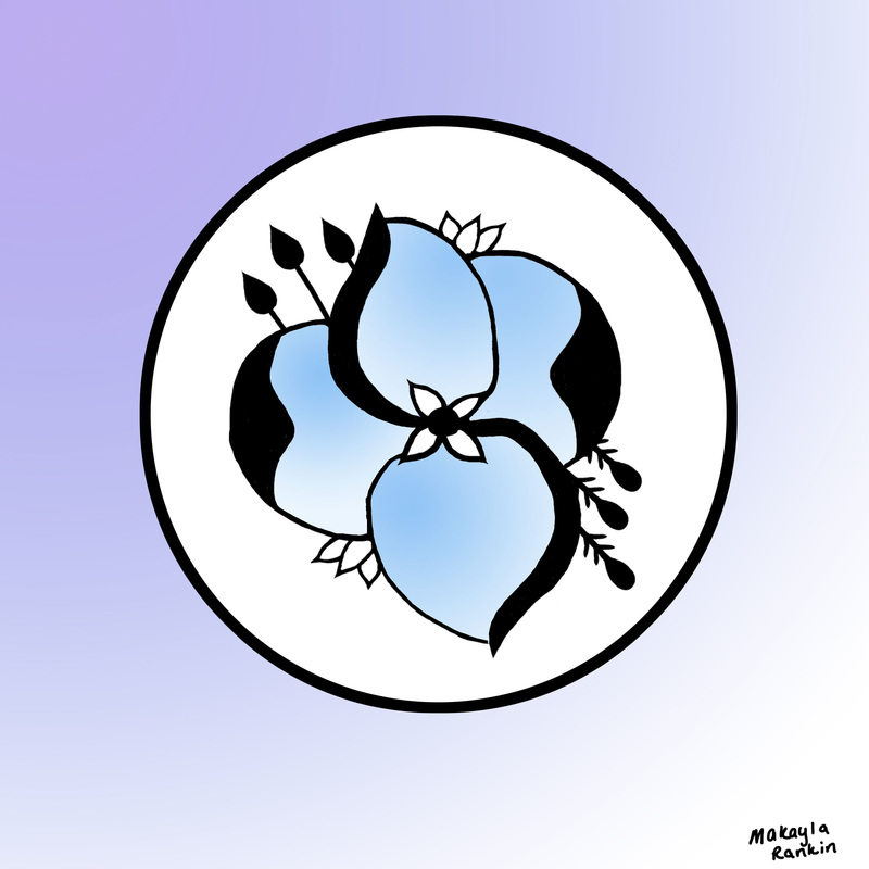
I used analogous colors, and I do feel like the colors match the expressions of the figure. I selected my background because it had some purples and some blues that matched my color theory. I do feel like I used tints, tones, and shades. I think value is the strongest element of art in my project. For the bottom picture, I used the sepia filter, and for the top one it is a silhouette. I'm not sure completely why I chose these two photos out of all of them, they seemed very appealing to the eye to me. I feel like the strongest element of art in both of the photos is value. I did enjoy learning about digital photography because I've always loved photography and I always thought that photographers only used the camera they have to make such photos, but they also sometimes use photoshop.
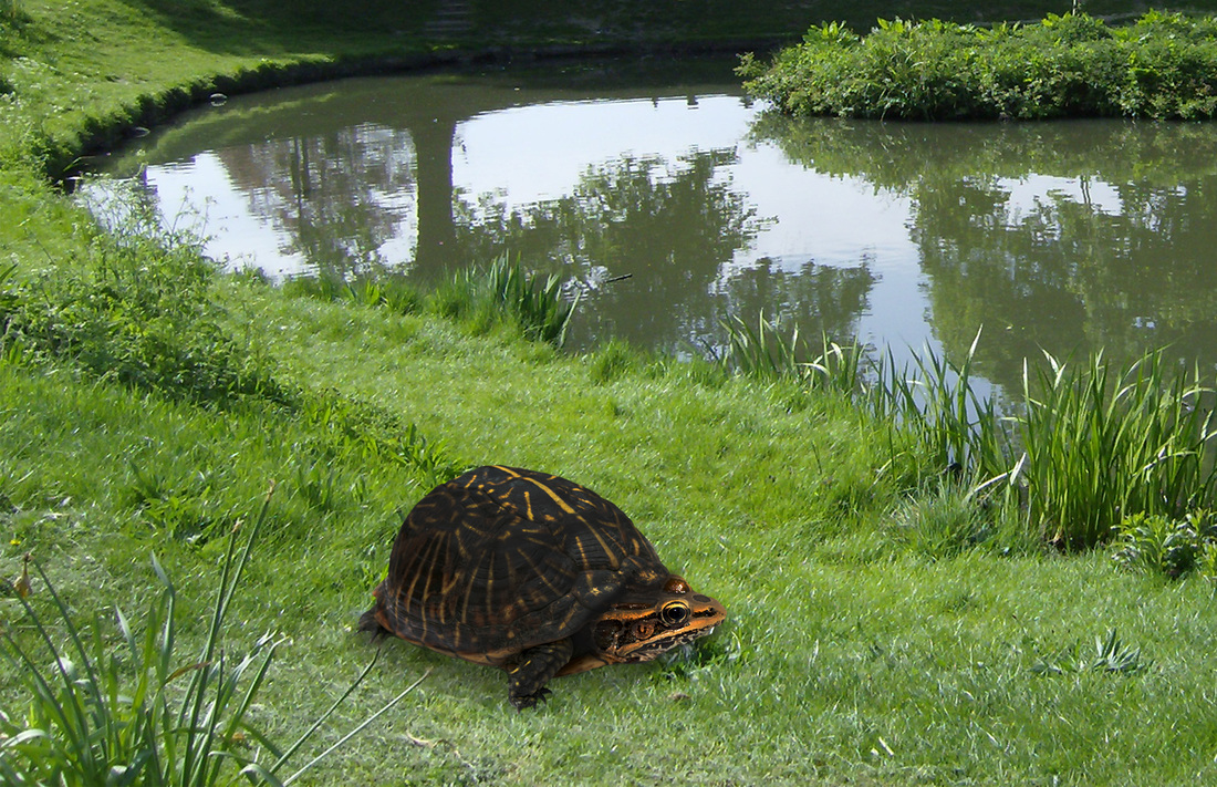
I made a turtle combined with a frog. The two tools that worked the best were the burn tool and the lasso tool. Space/perspective and unity were the two elements and principles that I used for this because the tools I used made it look more together and the space is good because it isn't too big or small.
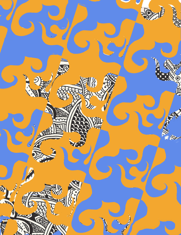
I feel like the principle of art that is the strongest is pattern and the strongest element is shape. I feel like making a tessellation on paper instead of one on the computer is easier. I feel like that is easier because you don't have as many layers and colors to keep up with , and you have to do all of that on the computer. And if you mess up on paper, you just have to erase it and only the part where you messed up, but if you have to erase something one the computer, most of the time it ends up erasing too much or too little. The artist we learned about before doing this was M.C. Escher.
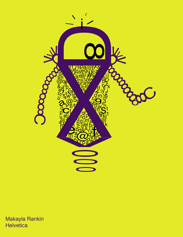
Font Bot
The font I used was Helvetica, and it is san serif. I feel like the font I used matches my font bot. At times I did like the process of creating this in photoshop, but when I had to do the more complicated things, like the arms and the inside of the body, it was really hard and a little frustrating at times. But overall it was great to use. I have a feeling that my little font bot would be a great robot. He would be one of those helpful robots that help people carry their things and hold doors open and cook meals and drive cars and clean and do all of those things. Square 1 Art Project
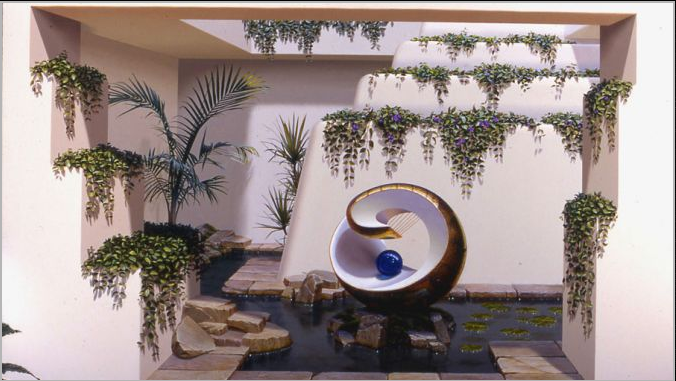
The process in creating this artwork was difficult at first, but got easier as I got used to using the drawing tablet and Photoshop. I started by drawing the basic outline of it, then adding the details and colors. My strongest element of art I used was value and my strongest principle was proportion. I didn't like using the tablet at first, but as I kept using it I got better and better at it and then liked it. I used high contrast in the project because the background to the artwork is a bright color, and fades to white. That, I think causes the black to go against the background, and draws attention to itself. This is a mural done by John Pugh. I like the way he paints and does these murals, they look very, very realistic. Pugh designed these murals to be very large, and to be visual to large audiences. They are also supposed to be a kind of optical illusion, playing a trick on the human eye. He designs these murals by looking at his surrounding location. He sometimes takes the same location and paints a different time period of the same location. Here's a link to more of Pugh's artwork.
|
